After posting my black & white studies of things around the house yesterday, I got to fooling around some more in Photoshop™ with the original photos, this time in color. There were some interesting results.
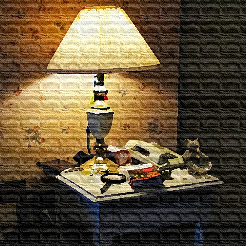
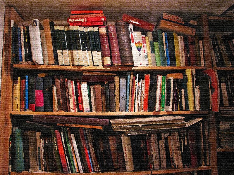
The first two shots here are fairly tame, just my old standard oil on canvas look. The bookshelf shot (bottom) was a natural for the Impressionist treatment, but that night table shot cried out for a little more dramatic treatment of the lighting to achieve a de la Tour type of effect, so I added a little brightening and then amped up the contrast. It seems to have worked out well.
The first two shots here are fairly tame, just my old standard oil on canvas look. The bookshelf shot (bottom) was a natural for the Impressionist treatment, but that night table shot cried out for a little more dramatic treatment of the lighting to achieve a de la Tour type of effect, so I added a little brightening and then amped up the contrast. It seems to have worked out well.


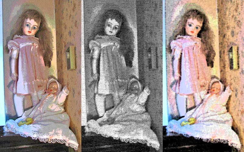
Yesterday Baino commented that the shot of the old dolls gave her the creeps. I think what I did to that shot last night makes them even scarier! The shot on the left isn't so bad; all I did was amp up the color saturation some and apply some "posterize" effect to create the look of an illustration in an early 20th Century book. But using that posterized version as a basis for further exploration created some real creepiness. First I applied a conté crayon filter (middle shot)to create a rough black & white textured effect that would look really well as an illustration to one of Poe's child-bride-dying-of-consumption poems. And using the same color posterized version, I applied a fiber paper filter (right shot) that made her them look like Chuckie's wife and infant daughter! Okay, Hels, is that creepy enough for you? heh, heh!

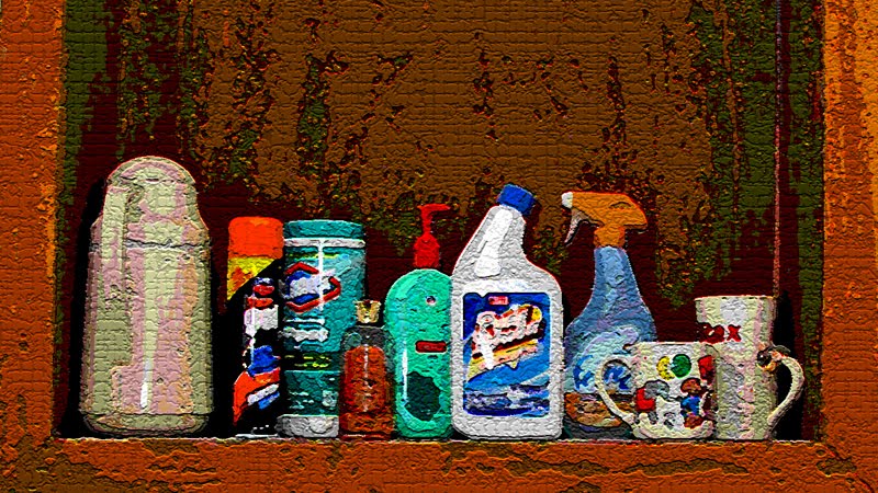
The last is the bathroom shelf shot. I tried a bunch of things with this and it just didn't work. After I discovered how well the posterize filter worked with the dolls, I tried it with this one, too. After that I applied a sandstone texture from the texturizer filter because it tends to make "painted" images look like watercolors on the usual watercolor paper. That worked well, but I wanted to see what the other textures would do; I hit the jackpot with the craquelure texture. Normally you use this one to create that cracked surface of an old oil painting (called "crazing" in the art world), but cranked up a bit and applied to this posterized image it made it look like paint had been applied heavily with a pallet knife, or as if this was a painting on wood that had been outside for years and got cratered and cracked by weathering. Great effect!

And that's what kind of fun you can have with Photoshop™!
© 2010 by A. Roy Hilbinger


...love what you did on the first shot...and everything you did on the last. The photoshop effects are pretty cool.
ReplyDelete